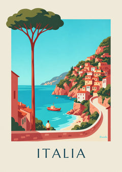
Building a travel gallery wall that tells your getaways
10 proven tips for designing a travel gallery wall that tells a story. Choosing posters, palette, height, framing, lighting: the complete Brunelia guide.

Key points
- 511 posters in the Travel posters collection, the 20 from this article in the table below.
- From 17,95 € in A4, up to 69,95 € in A0, 5 sizes for each poster.
- Printed in Italy on demand, free delivery from 59 €.
The table
The 20 posters at a glance






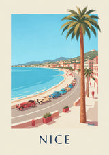

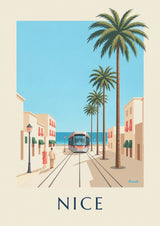
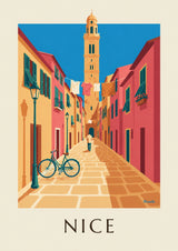



Designing a travel gallery wall means telling the story of your escapes without ending up with a messy travel log. The golden rule: visual coherence, a restrained palette, and a dominant size that structures the whole.
3 approaches work. The themed wall (one destination, several moods), the palette wall (coherent colors, varied subjects), or the chronological wall (from Southeast Asia to the Mediterranean). Always start with a centerpiece in large A1 size, then build around it in A3 and A4.
Our travel posters catalog covers every continent in Art Deco style. Combine it with our Italy posters or Japan posters for targeted escapes. Aged wood or matte black metal frames for visual unity.
The travel gallery wall: telling the story of your escapes without making a fetish of them
A well-composed travel gallery wall tells people who you are without slipping into showy storytelling. That is the difference between the home of a true traveler (where every poster means something) and the home of someone who wants to look like a traveler (where every poster is a status symbol). Here is how to design a travel gallery wall that rings true.
The principle: a story, not a pile-up
A travel gallery wall that works tells a story, not a list. The rule: 3 or 5 posters tied together by a strong common thread (the same palette, a single region, or the same size), no more.
1. Choose the common thread
3 classic options: by palette (all in terracotta and deep blue), by region (all Mediterranean, or all Brittany), or by size (all A3 portrait). Mixing all 3 threads tips the wall into clutter. Pick one and stick with it.
2. 3 posters is the bare minimum
A single poster stands alone. 2 posters compete or look alike. 3 posters tell a story. It is the rule of narrative composition in photography as much as in a gallery wall: 3 elements are enough to create rhythm.
3. One centerpiece + 2 satellites
Always one dominant poster (ideally A2) in the center, with 2 satellites in A4 or A5 on either side. The centerpiece carries the story, the satellites expand on it. Leave 5 cm between frames.
4. Eye level as a constraint
The visual center of the arrangement should sit 155-160 cm from the floor. Above a piece of furniture (sofa, console), the bottom of the arrangement should sit 25-30 cm above it. No higher, or the gallery wall “floats.”
5. The same frame for every poster
For a travel gallery wall that holds together, choose ONE type of frame (light wood OR black metal OR cream mat). Mixing frames destroys the unity. It is what takes a gallery wall from amateur to pro.
6. Pairings that work
3 Mediterranean posters: Cassis + Bandol + La Ciotat. 3 Provence posters: lavender + village + olive grove. 3 Atlantic posters: Brittany + the Basque Country + Charente. Always a triple echo, never a mix.
The travel gallery wall is an exercise in visual storytelling. The key rule: the less you put up, the more it says. A crowded wall of 12 posters is worth less than a wall of 3 well-chosen ones. Travel is told through restraint, through what you suggest, not through accumulation.
Also read: 15 compositions that work, which size to choose.
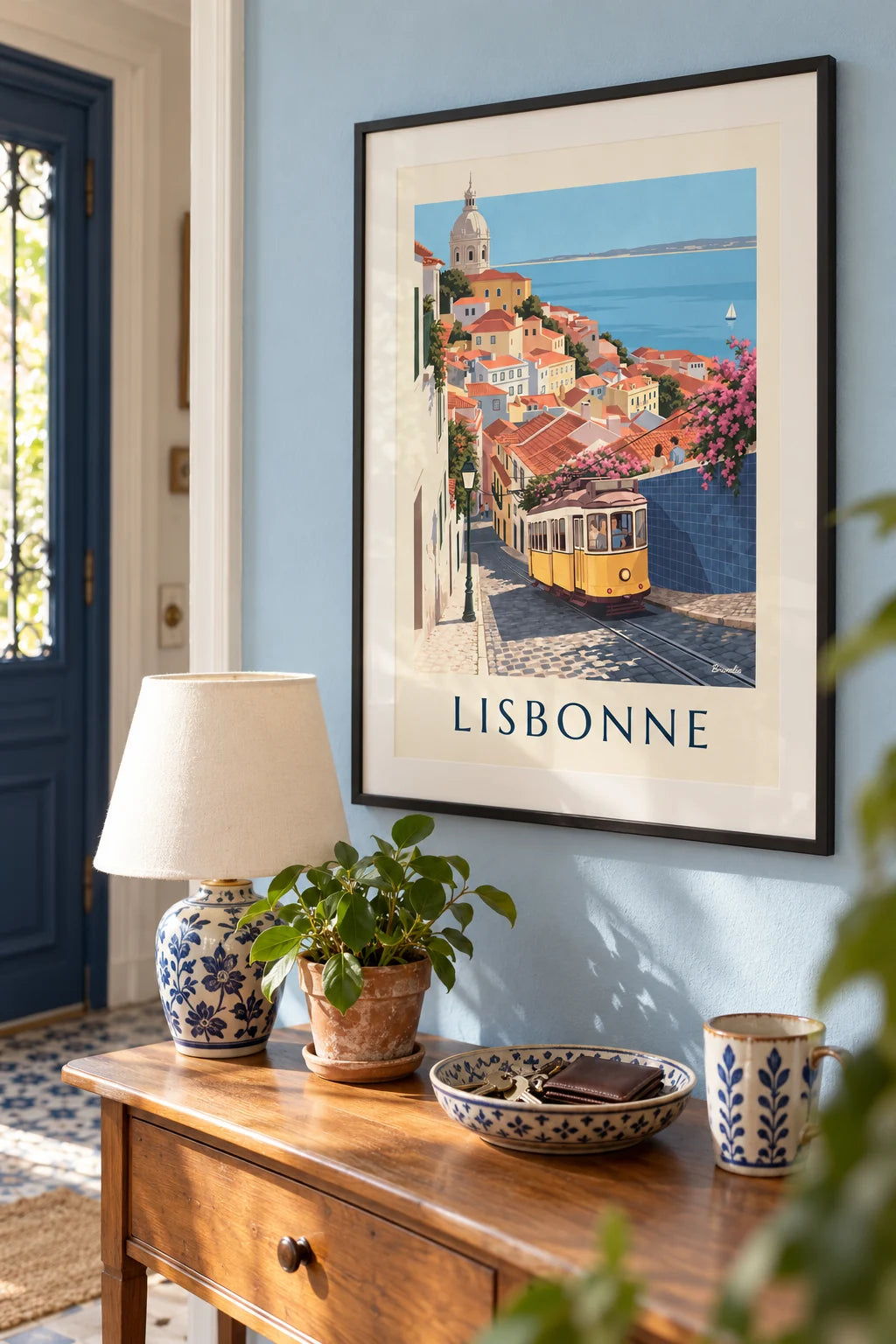
Build this wall
3 posters from this article, at true scale

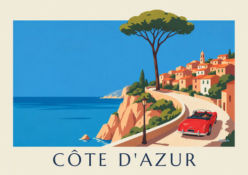

All 3 posters: 99,85 €
Frequently asked questions
You often ask us
How do you design a travel gallery wall?
Choose one coherent part of the world (the Mediterranean, Asia, or the Americas). Use 5 to 9 posters in varied sizes (A4 to A2), grouped asymmetrically around a central axis, with 4 cm between frames.
Which destinations should you choose for a travel wall?
Favor your real geography (places you have actually visited) over your dream geography. An authentic travel wall tells people who you are, not who you want to seem.
Which colors unify a travel gallery wall?
Terracotta, ocher, deep blue, olive green, off-white. Color consistency matters more than geographic consistency. Avoid posters with pop-level saturation.
Which sizes work for a travel gallery wall?
A mix of A4, A3 and A2 in mismatched frames. Deliberate asymmetry in a bohemian spirit. 5 to 9 frames in total.
Which pitfalls should you avoid with a travel gallery wall?
Over-representation of Bali, Morocco and Tokyo (Pinterest). Photographic posters with no retro patina. Excessive geographic variety that dilutes your personal signature.
Keep exploring